Published in 2012 by the Digital Scholarship Lab at the University of Richmond, Visualizing Emancipation is a interactive digital project “mapping the interactions between federal policies, armies in the field, and the actions of enslaved men and women on countless farms and city blocks.” Geared toward scholars, students, and teachers alike, Visualizing Emancipation provides a geographic examination of emancipation during and after the Civil War,
Various sections of the website serve as a digital narrative, teaching resource, and data set. First and foremost, visitors to the site will land on the map page, though an instructional introduction lays out the website’s purpose (quoted above) and its intended audience,then provides links to three different pages: “For Teachers,” “Get Started,” and “Learn More.” We shall return to the latter two, because while “Get Started” brings visitors right to the map, “Learn More” sends visitors to the “About” page, which is useful context for exploring the website.
(It is worth noting, additionally, that “Learn More” should really read as something which more definitively points to an “About” page. Those pages are additionally accessible by the “About the Project” link at the top of the map page.)
The “About the Project” section notes the basics of the project, a discussion of methods, an explanation of the types of events, and a rundown of the contributors to the project. The data for the project comes primarily from the Official Records of the War of the Rebellion (Washington, DC: Government Printing Office, 1880-1901), and the authors are careful to note the distinctions in various sections of the army, territorial legalities of slavery, and differences in emancipation events. The latter, in particular, helps explain why some of the red-dot emancipation events have particularly large halos around them–many events, especially those of sexual violence, could not be pinpointed with particular accuracy. In total, the undergraduate students scouring a number of contemporary sources, especially the University of Virginia Valley of the Shadow project, compiled over 3400 events.
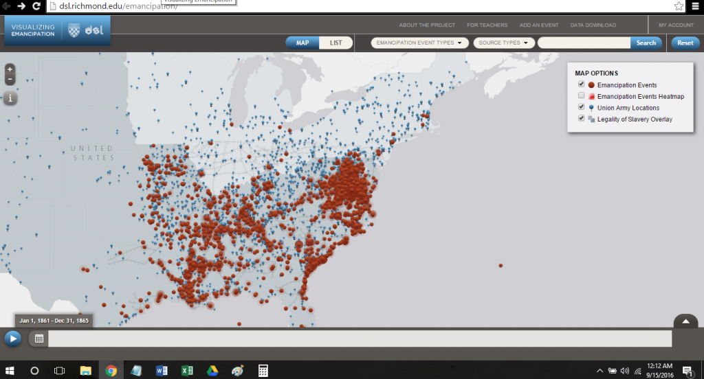
Moving to the map, users are initially met with a screen zoomed out to encompass the entire South and most of the theater of the Civil War:
Pressing the play button in the bottom left-hand corner begins a timeline scrolling on the bottom of the screen corresponding to month-long segments of the Civil War. Given records available, pins appear on the map detailing the position of Union troops, while emancipations appear as they occurred, then disappear. Filters are available in the top right-hand corner of the screen. The “heatmap” option is not selected by default, though it is useful for providing a more general overlay.
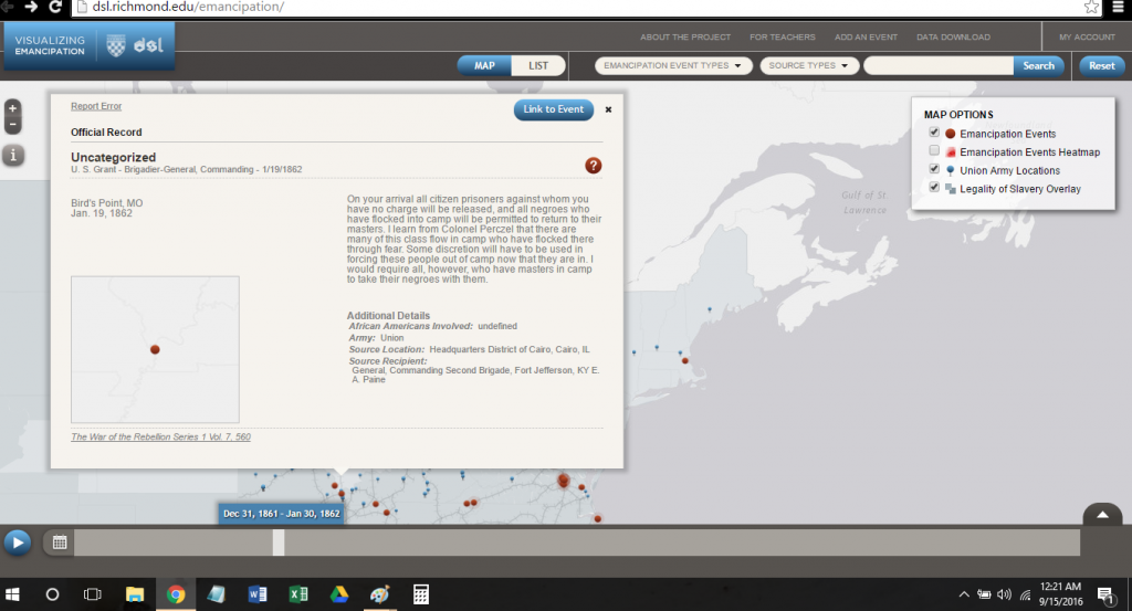
Clicking the events opens a popout screen within the map:
The popout box, while a bit cumbersome, contains a lot of detail. A newspaper description of the event, along with details as available, a date, and a citation provide context for the emancipation. Moreover, the dropdown menus immediately above the map allow the user to sort events (the above example is “Uncategorized”) like “Fugitive Slaves/Runaways” or “Irregular Fighting (insurrection, raid),” among others, and source types.
Ultimately, the mapping timeline demonstrates a number of facets to emancipation. To be sure, older historians of Civil War era emancipation are vindicated–slave emancipations, especially self-emancipations, would occur in locations with little-to-no army presence. But it is clearer that as the Union army advanced, emancipations increased.
The For Teachers section provides a number of links and lesson plans for teachers, particular upper-level high school and college. While the details are sparse and some pages beyond the landing page are under construction (have they ever not been?), Featured Events provides educators a useful jumping-off point for incorporating Visualizing Emancipation into the classroom through following individual emancipation to points on the map.
The project is ongoing, however. Links for scholars to submit events of emancipation and download the data as a KML file allows Visualizing Emancipation to be relevant to higher-level research and, much like other projects like the Living New Deal (which I use in the classroom through an interactive Google Docs project), continue to evolve.
Some confusing word choices (the landing page could do with a little more clarity of direction) and clunky layout in the “About” section (so much gray space in the margins) do create a nuisance but fail to distract from the overall impressive scope of the project. On a more scholarly level, adding the experiences of western slaves, particularly in Confederate Arizona and New Mexico, along with continuing to mine Northern cities for accounts of arriving emancipated slaves, would help to broaden the geographic focus. Emanicpation was a national experience, even if the political events of the time (like the Proclamation) did not, as the map nicely delineates, actually ban slavery in border states.
Also impressive is that Visualizing Emancipation works nicely on mobile devices and could be a boon to both interactive high school classrooms with iPad carts or college discussions where students may only have mobile devices. It is a solid and illuminating work of scholarship which continues an ongoing trend in historical scholarship to join space and experience together to expand the sociocultural history of slavery and emancipation.


