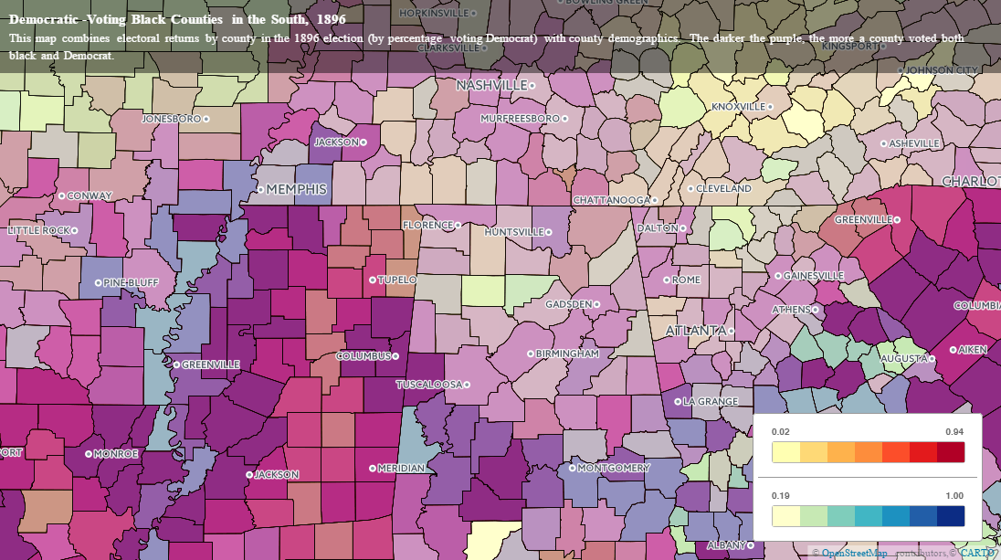
The map I’ve embedded below displays a combination of the 1890 census data by percentage African American with the percentage of each county voting Democratic in the election of 1896. The darker purple a county is, the more African American and Democrat-voting it was.
The map is enabled to toggle between four different layers, which I’ll briefly describe:
county_plus_vote is the layer which forms the blue chloropleth gradient in the legend. The darker blue a county, the higher percentage Democrat it voted. Turning all the other layers off would mean only this layer is displayed.
table_1890_black is the layer which forms the red (Emily says “warm colors” because I’m color-blind and need to ask for help) gradient in the legend. The darker red a county, the higher percentage of African Americans making up its population. Turning all the other layers off would mean only this layer is displayed.
table_1896_results is the layer which produces the information boxes when you scroll over a county. It doesn’t color the map at all (or at least it shouldn’t), so you’re not in for a very exciting map if this is the only one you turn on.
events_of_note is the on-going part of this map. Using the resources of Chronicling America through the Library of Congress, I am finding regions where there is a noticeable differentiation in color, then searching those cities’ newspapers with terms like “Negro [and] Bryan” in a 10-word proximity to see what political reports had to say about blacks’ participation in the election. Clicking on these points reveals a pop-out box with (1) the name of the article/editorial/news clipping, (2) where that clipping is from, and (3) a link to the primary source’s item page in Omeka.
There won’t be many events of note just quite yet, but we’re working on cataloging those in Omeka and adding them as points to the map. Feel free to play around with the map and zoom in on various counties! If there are issues with the functionality, please let me know in the comments.
The South Carolina Example:
You can see that the map is currently zoomed in on South Carolina as the default. Here’s why: I’m really curious about the divide between Richland County (home to Columbia, the state capital) and its surrounding counties. You’ll note that neighboring Sumter County (to the immediate east), with a higher percentage of African American voters than Columbia, voted even more overwhelmingly Democrat.
That led me to ask–why? Blacks are commonly associated with the Party of Lincoln, even in the South, and unless voter suppression had already taken place wholesale in Sumter County, it interests me to ask why voters might have gone Democrat.
Lo and behold, my Chronicling America search turned up the endorsement of Bryan and free silver by the Sumter Watchman and Southron, which reprinted an editorial from the Atlanta Daily Opinion. If you zoom in and click on the pin I’ve dropped, it leads to to the article’s Omeka page, where you can find a PDF.
More of these, along with bibliographic citations (particularly from Omar Ali’s In the Lion’s Mouth, will be forthcoming. The map, however, was the biggest technological hurdle to clear in this project, and I think we’ve really done something here which can open the door to questions about voter turnout (and suppression), rural-urban divides in Southern voting patterns, and regional distributions of Democratic votes and how those may overlap with distributions of African American voters–the Missouri River Valley in Missouri is particularly intriguing.

